DadyCar — Fleet Management Platform— Product Design Case Study
Product Designer · End-to-End UI/UX
Context
Fleet management in and Europe has a serious tooling problem. The companies that could benefit most from a modern operations platform — mid-size businesses running 20 to 200 vehicles — are stuck between two bad options: expensive enterprise software built for corporations, or nothing at all. Before DadyCar, their day looked like this: maintenance reminders in a notebook, fuel expenses in a shared spreadsheet, driver assignments via phone calls, and zero visibility into what was actually happening across their fleet in real time. DadyCar was built to close that gap — one unified platform where a fleet manager can see everything, act on anything, and lose nothing.
My Role
Full end-to-end product design of a B2B SaaS fleet management platform — from design tokens and component library to every screen across the full operational surface.
Our primary user is a 40+ year old fleet manager, office-based, non-technical, spending 6–8 hours a day inside this dashboard. This single insight ruled out dark themes, high visual complexity, and anything that prioritized aesthetics over clarity.
— Core User Insight
Overview
Full end-to-end product design of a B2B SaaS fleet management platform — from design tokens and component library to every screen across the full operational surface.
Challenge
Fleet managers relied on Excel files and disconnected tools with no real-time visibility. The primary user is a 40+ year old, office-based, non-technical fleet manager spending 6–8 hours daily inside the dashboard — requiring clarity and speed above everything.
Solution
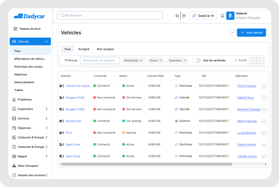
A light, data-focused dashboard built on a complete design system — design tokens, 60+ components, all states. Combined with progressive disclosure patterns to handle complex workflows without overwhelming non-technical users.
Design Challenges
Where the Hard Thinking Happened
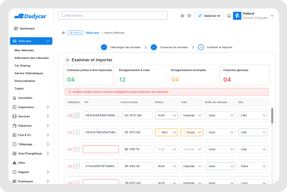
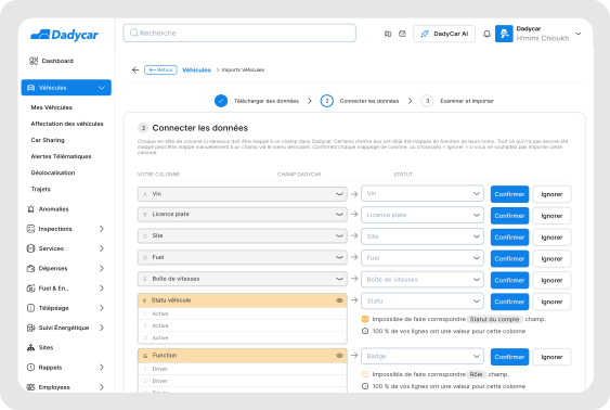
Bulk Import — Designing for Error, Not Success
The Problem
Fleet managers needed to upload hundreds of vehicles at once via CSV or Excel — but their data was always messy: missing fields, wrong formats, duplicate entries. Early versions displayed the full imported table with all errors flagged inline. Pilot feedback was immediate: "I don't know where to start. There's too much."
The Solution
Progressive disclosure across 4 steps: Upload → Column Mapping → Error Review (only problematic rows) → Confirm Summary. Show users one decision at a time, not all their problems at once.
Don't show users their problems all at once. Show them one decision at a time.
Roles & Permissions — Designing Invisible Complexity
The Problem
The platform needed a permissions system flexible enough for companies with very different org structures — some with one fleet manager, others with regional supervisors, field coordinators, and read-only executives — without making configuration feel like an IT task.
The Solution
A two-layer approach: predefined roles with sensible defaults for the majority of users, plus custom permission toggles per role for specific needs — designed as a clear scannable matrix. Every feature was also designed with its disabled and hidden state.
Role-based access is completely invisible when it works well and completely broken when it doesn't.
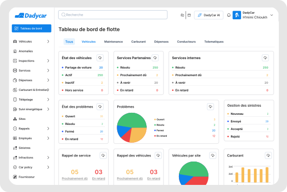
Dashboard — What Does 'At a Glance' Actually Mean?
The Problem
A fleet management dashboard can display hundreds of data points. The real design question was: what does a fleet manager need to know in the first 10 seconds of their morning?
The Solution
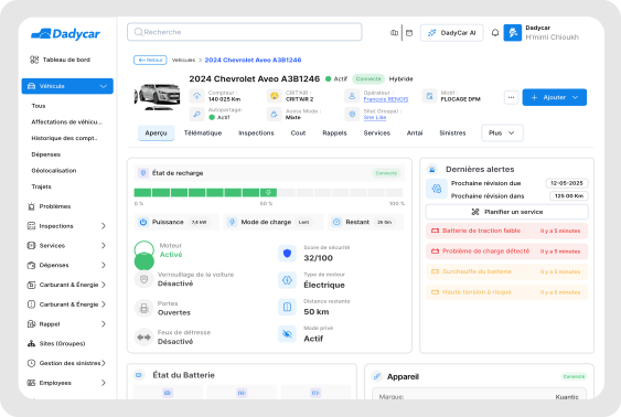
Through sessions with pilot users we identified the true priority order: (1) Are any vehicles in a critical state? (2) What maintenance is due this week? (3) How are my costs trending? The dashboard was designed around this hierarchy.
Hierarchy is not a visual decision — it is a user research decision.
Selected Screens
Impact & Results
What This Project Achieved
Learnings
What I'd Tell Myself at the Start
Design for your actual user, not for designers.
Every time I was tempted to make something visually clever, I asked: would a 45-year-old fleet manager find what they need here in 3 seconds?
The design system is the product, not just a support tool.
On a platform this large, consistency is a feature. The time invested in tokens and components upfront saved weeks of inconsistency fixes later.
The unsexy flows are often the most important ones.
Bulk import, document expiry reminders, permission configuration — none are headline features. All of them are what users actually spend their time in.
Winning an award is a milestone, not a finish line.
Pilot feedback is still coming in. The best version of DadyCar is still being designed.
Tools & Methods