FocusCare — Pre-Surgical Clinical Workflow Platform— Product Design Case Study
Product Designer · End-to-End UI/UX
Context
Pre-surgical workflows at hospitals are notoriously fragmented. Paper forms, disconnected EHR systems, manual phone calls between departments, and patients showing up unprepared — these delays cost hospitals millions annually in cancelled surgeries and wasted resources. FocusCare was built to digitize and streamline the entire pre-surgical patient journey.
My Role
Complete product redesign of a pre-surgical workflow platform — from patient intake forms through post-op instructions, covering 12 distinct user journeys across 3 user roles.
Our users are dual: clinical staff who need speed and accuracy in high-stress environments, and patients (often elderly or anxious) who need clarity and reassurance. Both needed to be served without compromising the other.
— Core User Insight
Overview
Complete product redesign of a pre-surgical workflow platform — from patient intake forms through post-op instructions, covering 12 distinct user journeys across 3 user roles.
Challenge
The existing product was functional but cluttered, with 15+ page navigations required to complete a single patient workflow. Both clinical staff and patients were frustrated. The product averaged 2.8 stars in app store reviews.
Solution
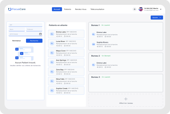
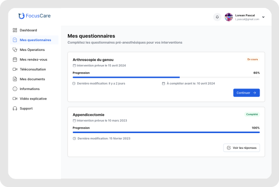
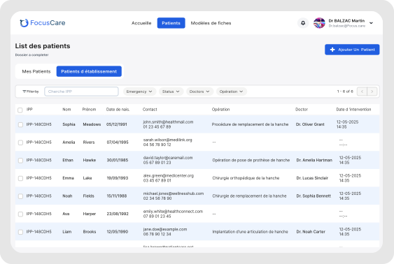
A role-based dashboard that surfaces the right information for each user — clinical staff get quick-action views with batch processing capabilities, while patients get a guided, reassuring journey with clear progress indicators and timely reminders.
Design Challenges
Where the Hard Thinking Happened
Patient vs. Clinical — Two Users, One Product
The Problem
Clinical staff needed speed (processing dozens of patients daily), while patients needed hand-holding (often elderly, anxious, unfamiliar with medical processes). The existing interface served neither well.
The Solution
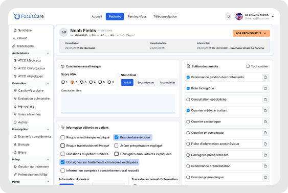
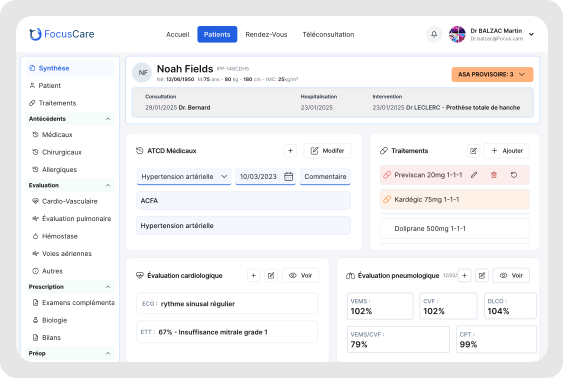
Two distinct dashboard views: Clinical gets a list/table view with bulk actions and keyboard shortcuts. Patients get a step-by-step guided flow with plain-language instructions, progress bars, and gentle reminders.
One product can be two different experiences. Design for each user's context, not your own.
EHR Integration — Designing Around Constraints
The Problem
Integration with hospital EHR systems was limited to certain data formats and update frequencies. We couldn't redesign the underlying data — only how it was displayed and collected.
The Solution
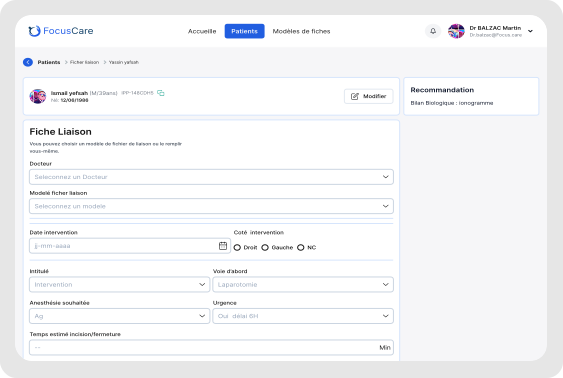
A flexible form engine that adapts to available EHR fields, with graceful degradation for missing data. Smart defaults populated where possible, clear indicators when manual entry was required.
Work with constraints, not against them. Limitations often drive the most creative solutions.
Compliance Without Complexity
The Problem
HIPAA and hospital compliance requirements meant certain fields had to be locked, certain actions had to be logged, and audit trails had to exist. But compliance UI often felt like a wall between users and their tasks.
The Solution
Compliance as background behavior where possible (auto-logging, silent validation), and contextual prompts where user action was needed. RedACTION required for sensitive actions made them feel purposeful, not punitive.
Compliance doesn't have to feel like bureaucracy. Make it feel like care.
Selected Screens
Impact & Results
What This Project Achieved
Learnings
What I'd Tell Myself at the Start
Dual-user products need dual research.
I spent equal time in clinical environments and with patients. Both revealed needs that would have been invisible studying only one group.
Speed for experts and comfort for beginners can coexist.
The same underlying platform can offer different interfaces, shortcuts for power users, and guided flows for new users — without doubling maintenance.
Compliance is a feature, not a constraint.
When we designed compliance into the experience rather than around it, it became a selling point ("your data is protected") rather than a friction point.
Healthcare moves slow. That's okay.
12-month pilot programs are normal in healthcare. Design for the long haul — iterative improvements beat big-bang launches.
Tools & Methods