Resaglob — Travel Agency Hotel Booking System— Product Design Case Study
Product Designer · End-to-End UI/UX
Context
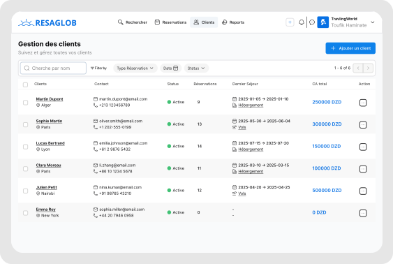
Travel agencies in Algeria are sitting at the intersection of high client expectations and outdated tooling. Their clients want fast, reliable hotel reservations anywhere in the world. Their tools — consumer platforms like Booking.com, legacy interfaces with poor UX, and manual Excel spreadsheets — were never designed for professional agency workflows. The breaking point was data reliability. A room showing as available in the morning could already be booked by the time the agent finished entering the client's information. Resaglob was built to fix that — a B2B SaaS platform where travel agencies subscribe, connect to live hotel inventory via supplier APIs, and manage the full reservation workflow in one place, from search to confirmed booking.
My Role
Full end-to-end product design of a B2B travel agency SaaS — a professional hotel and flight booking platform connecting Algerian travel agencies to worldwide live inventory via supplier APIs.
Every tool available to travel agents was either built for consumers (Booking.com) or built for IT departments (legacy GDS). Nothing was built for a non-technical professional who needs to move fast and get it right.
— Core User Insight
Overview
Full end-to-end product design of a B2B travel agency SaaS — a professional hotel and flight booking platform connecting Algerian travel agencies to worldwide live inventory via supplier APIs.
Challenge
Agents used consumer platforms and legacy tools with stale inventory data. Rooms shown as available were sometimes already booked by the time the agent confirmed with the client. No unified workflow existed between search, client data entry, and booking confirmation.
Solution
A unified booking platform with a tabbed smart search bar, progressive data density across search results and hotel detail views, real-time inventory indicators, graceful race condition error handling, and skeleton loading states for slow API responses.
Design Challenges
Where the Hard Thinking Happened
The Search Bar — Making Complexity Disappear
The Problem
Hotel search requires: destination, check-in and check-out dates, number of adults, number of children, age of each child, number of rooms, and occupancy per room. Presented wrong it looks like a form from 2009. The agent needs to move through this in seconds while a client is sitting across from them waiting.
The Solution
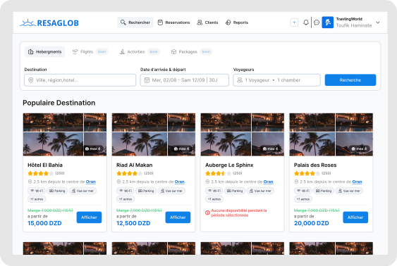
A tabbed search bar with three modes — Hotels, Flights, Packages. Each tab shows only its relevant fields. The guest and room configuration collapses into one field that opens a clean popover: "2 adults · 1 child (age 7) · 1 room". The complexity lives in the popover, not on the surface. Early agent testing confirmed: "I liked how the search felt. It was clear what I needed to fill."
The complexity lives in the popover, not on the surface. An agent who has done this a hundred times moves through it in seconds.
Real-Time Inventory — Designing for the Race Condition
The Problem
A room showing as available can get booked by another agency while the agent is mid-reservation. After the agent has already told their client "I've got your room." This race condition cannot be fully prevented technically — but the UX response to it can be the difference between a professional recovery and a broken experience.
The Solution
Two-part response: (1) Transparency — search results show a last-updated timestamp and live availability indicator. Manual refresh always one click away. (2) Graceful failure — if a room becomes unavailable at confirmation, the system shows: "This room was just taken. Here are the next best available options." The agent stays in the flow. Skeleton loading and progress bars throughout ensure slow API responses never look like crashes.
Design for failure, not just success. A well-designed error keeps the agent professional in front of their client.
Dense Hotel Data — Progressive Information Reveal
The Problem
Each hotel result contains: name, location, star rating, images, amenities, cancellation policy. Each room type contains: name, occupancy, bed configuration, inclusions, price per night, total price, cancellation terms, availability. Multiply across dozens of results and the screen becomes overwhelming immediately.
The Solution
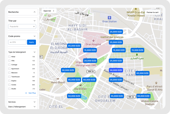
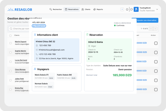
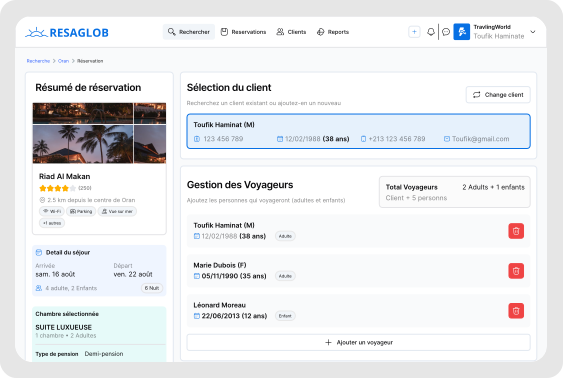
Progressive data density across three levels: (1) Search results — hotel name, star rating, location, lowest price, one image. Enough to compare, nothing more. (2) Hotel detail — all room types, full pricing, amenity list, policies. (3) Booking form — client details, special requests, payment, confirmation. Each step reveals more detail only when the agent is ready for it.
Cognitive load stays manageable when each step reveals only what the agent needs to decide right now.
Selected Screens
Impact & Results
What This Project Achieved
Learnings
What I'd Tell Myself at the Start
The search bar is the product.
In a booking tool, the search experience sets the tone for everything that follows. Getting it right was worth more design time than any other single element.
Design for failure, not just success.
The race condition problem showed that the most important screens in a booking flow are the error screens. A well-designed failure message keeps the agent professional. A poorly designed one destroys trust instantly.
Loading states are UX, not engineering.
When data comes from external APIs, slowness is inevitable. Skeleton screens and progress indicators are the difference between an agent thinking the tool is broken and an agent trusting it is working.
A lean team forces design clarity.
With one frontend developer, there was no room for complexity for complexity's sake. Every design decision had to be justifiable in implementation terms. That constraint produced a cleaner product.
Tools & Methods